Pixels Have Feelings: How the Apps You Use Every Day Are Quietly Messing With Your Head
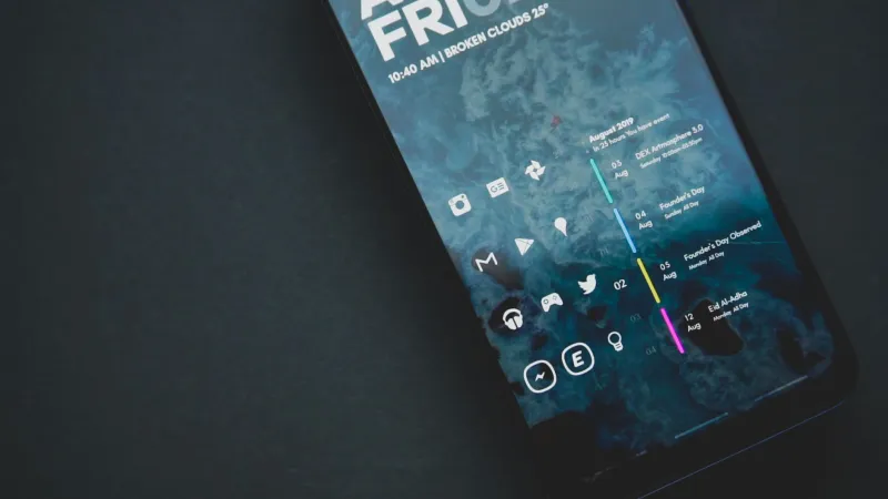
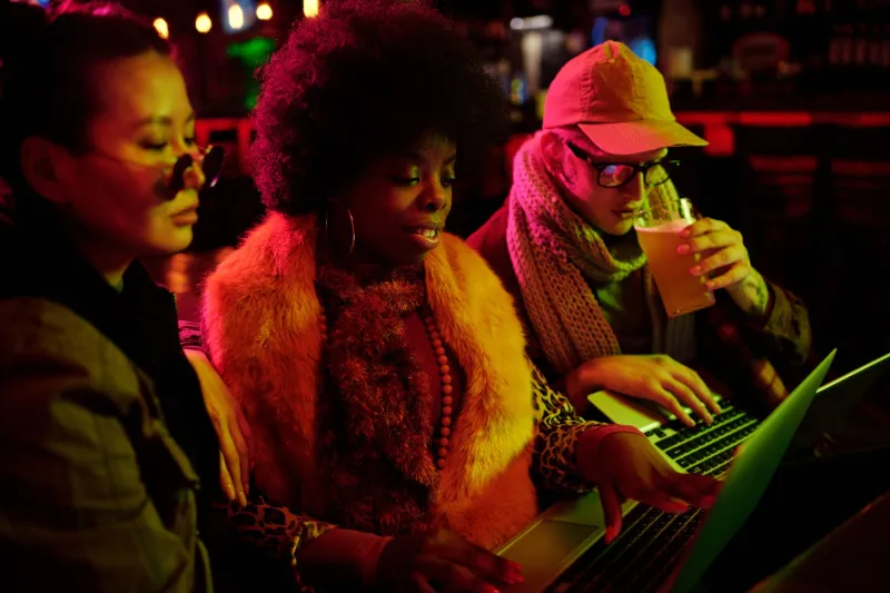
Open your phone. Look at your most-used app. Now ask yourself: why does it look like that?
Not in a paranoid way. Just — genuinely — why those colors, those shapes, that particular weight of type? Why does one banking app feel clinical and trustworthy while another feels playful and slightly unserious? Why does opening some apps feel like walking into a clean room and others feel like stepping into a neon-lit arcade?
None of it is an accident. App design is one of the most psychologically loaded disciplines in modern tech, and most of us interact with its outputs hundreds of times a day without thinking about the decisions baked into every pixel. Let's fix that.
The Era We Came From: Skeuomorphism's Comfortable Lies
To understand where design is now, you have to go back to where it started — specifically, to the early iPhone era and the design philosophy called skeuomorphism. The idea was simple: make digital interfaces look like physical objects people already understood. The Notes app looked like a legal pad. The calendar had fake leather stitching. The bookshelf had actual wood grain.
It sounds almost quaint now, but the logic was sound. In 2007, smartphones were genuinely new and slightly terrifying. Making a digital button look like a physical button — with a drop shadow, a gradient, a slight bevel — told users: this is safe, this works the way you expect. It was design as reassurance.
The problem was that it also dated fast and, as screens got better, it started to feel cluttered and a little condescending. By 2013, Apple's iOS 7 dropped the skeuomorphic approach almost entirely and ushered in the flat design era — and the culture shock was real.
Flat Design: When Minimalism Got Militant
Flat design stripped away the shadows, gradients, and fake textures. Everything became bold, clean, geometric. Google's Material Design codified this into a system. Microsoft's Metro interface took it even further. The aesthetic was modern, confident, and — if we're being honest — sometimes brutally cold.
Designers and critics debated whether flat design had gone too far. Without visual affordances (the subtle cues that tell you something is clickable), interfaces could become confusing. The trash can icon doesn't look like a trash can anymore; it's just a shape you've been trained to associate with deletion. That's a learned behavior, not an intuitive one.
But flat design also did something psychologically interesting: it democratized the visual language of tech. When everything is a clean rectangle on a white background, the hierarchy of information becomes the design. What's big, what's small, what comes first — these choices carry all the weight. It forced designers to think harder about structure.
The Pendulum Swings: Neo-Brutalism and Glassmorphism Walk Into a Bar
Here's where things get genuinely interesting. Contemporary UI design has fractured into multiple competing aesthetics, each carrying its own psychological payload.
Glassmorphism — frosted, translucent panels that seem to float above a blurred background — is everywhere right now. Apple's visionOS leans into it hard. Windows 11 uses it. Dozens of app interfaces have adopted the aesthetic. Psychologically, glassmorphism signals lightness and sophistication. The blur effect creates depth without weight. It feels premium in a way that's hard to articulate, which is exactly the point.
Neo-brutalism, on the other hand, is its loud, confrontational cousin. Think thick black borders, flat blocks of color, deliberately "broken" layouts, visible grid structures. Figma's community has gone deep on this. Startups like Gumroad and Linear have flirted with brutalist elements. The psychological message is almost the opposite of glassmorphism: we're not trying to seduce you. We're being direct. This is the interface equivalent of a firm handshake.
The fact that both aesthetics are thriving simultaneously says something real about where we are culturally. There's an audience for aspirational softness and an audience for aggressive honesty, and designers are serving both.
The Psychology Is the Point
None of this is purely aesthetic. Design decisions have documented behavioral effects, and the tech industry knows it.
Rounded corners, for instance, aren't just a style choice. Research consistently shows that humans find rounded shapes less threatening than angular ones — a preference that likely traces back to evolutionary pattern recognition (sharp edges in nature often mean danger). Apps that want you to feel comfortable and safe round their corners. Apps that want to feel authoritative sometimes don't.
Color is even more loaded. The prevalence of blue in social media and productivity apps (Facebook, Twitter/X, LinkedIn, Zoom) isn't coincidental — blue consistently tests as trustworthy and calm in Western cultural contexts. Red creates urgency, which is why notification badges are red. The entire visual grammar of "you need to look at this" is built on color psychology that most users absorb without realizing it.
Typography carries weight too. Rounded sans-serif fonts feel approachable and modern (see: every tech startup that switched to a custom rounded typeface in the last five years). Sharp serif fonts signal authority and tradition. When a fintech app uses a slightly editorial serif typeface, it's borrowing credibility from newspapers and law firms.
The People Actually Making These Decisions
Designers like Rashaad Newsome — who works at the intersection of technology and visual art — have talked publicly about how the aesthetics of interfaces encode values, not just preferences. When a design system is built by a homogeneous team, it tends to assume a homogeneous user. The push for more diverse design teams is partly an aesthetic argument: different visual vocabularies produce different, richer interfaces.
 Photo: Rashaad Newsome, via wallpapercave.com
On the more technical side, developers working with design systems at companies like Vercel and Linear have been vocal in online communities about the shift toward "honest" interfaces — designs that don't try to hide their structure or pretend to be something they're not. It's a reaction to years of dark patterns and manipulative UX, and it's influencing how the next generation of tools looks.
What This Means for You
You don't have to become a designer to benefit from understanding this stuff. But knowing that the interface you're looking at was designed to produce a specific emotional response is genuinely useful information.
When an app feels trustworthy, ask why. When a checkout flow feels urgent, notice the red. When a subscription service's cancellation button is three menus deep and rendered in light gray text on a white background — that's a choice too, and it's not an accident.
The screens we stare at are not neutral surfaces. They're arguments — about what matters, how you should feel, and what you should do next. The least we can do is read them back.